In this guide, we will show you how to draw a map from start to finish. Learn about choosing materials, understanding scale, sketching the outline, adding details, labeling and notation, adding colors and textures, and finalizing the map.
Choosing the Right Materials
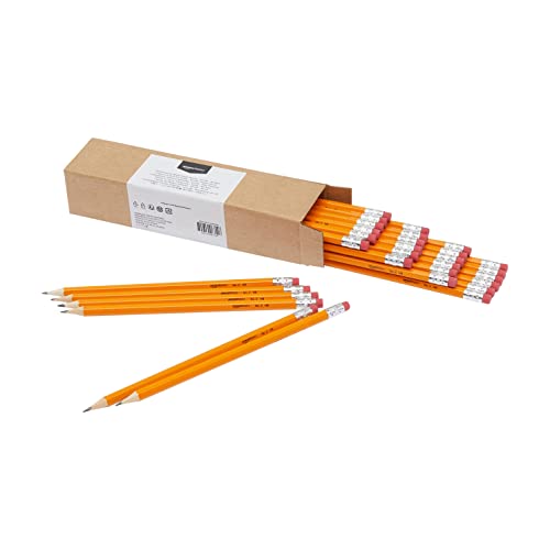
Paper and Pencils
Choosing the right materials for creating a map is essential to ensure a smooth and successful process. When it comes to paper, opt for a heavier weight paper that can withstand the pressure of sketching and erasing. Look for paper that has a smooth surface to allow your pencil to glide smoothly. Acid-free paper is also a good choice to prevent yellowing and deterioration over time.
For pencils, consider using graphite pencils with different levels of hardness. A set of pencils ranging from 2H to 6B can provide you with a variety of shades and line thicknesses. The harder pencils (2H to 4H) are ideal for sketching and outlining, while the softer pencils (2B to 6B) are great for shading and adding depth to your map.
Erasers and Sharpeners
Having the right erasers and sharpeners is crucial for maintaining precision in your map-making process. A kneaded eraser is a versatile tool that can be shaped and molded to erase small details or large areas. It leaves minimal residue and doesn’t damage the paper.
A good quality pencil sharpener ensures that your pencils are always sharp and ready to use. Look for sharpeners with a sharp blade that can create a fine point without breaking the pencil lead.

Rulers and Compasses
Rulers and compasses are essential tools for creating accurate and proportional maps. A transparent ruler with metric and imperial measurements is ideal for measuring distances and creating straight lines. Look for rulers that have a non-slip grip to prevent any accidental movements.
A compass is useful for creating circles and arcs on your map. It allows you to accurately plot points and draw curved lines. Look for a compass with a sturdy construction and a locking mechanism to keep your measurements in place.
With the right materials at hand, you can confidently embark on your map-making journey. Remember to choose paper and pencils that suit your preferences and needs, and invest in quality erasers, sharpeners, rulers, and compasses for precise and professional results.
Understanding Scale and Proportions
Determining the Scale
When creating a map, it’s crucial to determine the appropriate scale to accurately represent the geographic area. The scale refers to the ratio between the dimensions on the map and the actual dimensions on the ground. For example, a scale of 1:10,000 means that one unit on the map represents 10,000 units on the ground.
To determine the scale, consider the size and level of detail you want to include in your map. If you’re creating a map of a small neighborhood, a larger scale like 1:1,000 or 1:5,000 might be suitable. However, if you’re mapping an entire city or region, a smaller scale like 1:25,000 or 1:100,000 would be more appropriate.
Maintaining Proportions
Maintaining proportions is essential to create an accurate and visually appealing map. Proportions ensure that the relative sizes and distances between features on the map reflect their real-world counterparts. This helps users interpret the map correctly and navigate the depicted area with ease.
One way to maintain proportions is by using a grid or graph. By dividing the map into a grid, you can accurately plot the locations of different features and ensure they are proportionally spaced. Similarly, using a graph allows you to plot points and connect them to create accurate representations of slopes, curves, or other features.
It’s important to note that maintaining proportions becomes more challenging as the scale of the map decreases. As features are scaled down, it’s crucial to carefully consider the level of detail and simplification required to maintain clarity while preserving accurate proportions.
Using Grids or Graphs
Grids and graphs are valuable tools for maintaining proportions and ensuring accuracy in map drawing. Grids consist of a series of intersecting horizontal and vertical lines that create a framework for mapping. By aligning features with the grid lines, you can easily maintain proportions and create a visually pleasing map.
Graphs, on the other hand, are particularly useful when representing elevation or other continuous data. By plotting points on a graph and connecting them, you can accurately depict slopes, changes in elevation, or other quantitative information. This allows users to understand the terrain and topography of the mapped area more easily.

When using grids or graphs, it’s important to select an appropriate interval or spacing between the lines or points. This choice depends on the scale of the map and the level of detail required. Too many lines or points can clutter the map, while too few can result in a loss of accuracy.
Overall, understanding scale and proportions is essential for creating clear and accurate maps. By determining the scale, maintaining proportions, and utilizing grids or graphs, you can ensure that your map effectively communicates geographic information to its users.
Sketching the Outline
When it comes to creating a map, sketching the outline is an essential first step. This process involves identifying key landmarks, blocking out the general shape, and adding borders and boundaries. Let’s explore each of these steps in more detail:
Identifying Key Landmarks
Before you begin sketching the outline of your map, it’s important to identify the key landmarks that you want to include. These landmarks can be anything from prominent buildings and natural features to important roads or landmarks that hold significance to the map’s purpose. By identifying these landmarks, you can ensure that your map accurately represents the area you are depicting.
Blocking Out the General Shape
Once you have identified the key landmarks, it’s time to block out the general shape of your map. This involves sketching the basic outline of the area you are mapping, including any major landforms or bodies of water. Think of it as creating a rough sketch or skeleton of your map. This step helps you establish the overall layout and proportions of your map before diving into the finer details.

Adding Borders and Boundaries
To give your map a polished look, it’s important to add borders and boundaries. Borders help define the edges of your map and provide a clear visual separation between the map and its surroundings. They can be as simple as a solid line or more elaborate, depending on your preference and the style of the map. Boundaries, on the other hand, are used to demarcate different regions or areas within the map. They can be drawn as lines or shaded areas, depending on the level of detail you want to include.
By following these steps – identifying key landmarks, blocking out the general shape, and adding borders and boundaries – you can create a strong foundation for your map. This foundation will serve as a guide as you move on to adding details and features in the next steps. So grab your pencil and let’s start sketching the outline of your map!
Adding Details and Features
When creating a map, it’s important to add details and features that bring the landscape to life. By incorporating mountains, hills, bodies of water, roads, and paths, you can create a visually engaging and informative map that captures the essence of the area you are representing.
Drawing Mountains and Hills
Mountains and hills are key elements in any map, as they provide a sense of topography and elevation. To draw mountains, start by sketching the outline of the range using a series of jagged lines. Vary the height and width of the peaks to create a realistic representation. Then, use shading or hatching techniques to add depth and texture to the mountains. For hills, use smoother lines and softer shading to indicate a gentler slope.
Indicating Bodies of Water
Bodies of water, such as lakes, rivers, and oceans, are important features to include in a map. To depict them, start by outlining the shape of the water body using curved lines. Use shading or coloring techniques to differentiate between different depths or types of water. For example, you can use darker shades for deeper areas and lighter shades for shallow waters. Additionally, consider adding texture or ripples to indicate movement and give a more realistic representation.

Depicting Roads and Paths
Roads and paths are essential for navigation purposes on a map. They help users understand the connectivity and accessibility of different areas. To draw roads, use straight or curved lines to represent their paths. Consider using different line weights to indicate the size or importance of the road. For example, major highways can be represented with thicker lines compared to smaller local roads. Additionally, use symbols or markings to represent intersections, bridges, or other notable features along the roads and paths.
By incorporating these details and features into your map, you can create a visually appealing and informative representation of the area. Remember to consider the scale and proportions of your map to ensure accuracy and clarity.
Labeling and Notation
When creating a map, labeling and notation are essential to help users understand and navigate the information presented. Here are some key aspects to consider when labeling and adding notation to your map:
Naming Cities and Towns
One crucial element of a map is labeling cities and towns. By including the names of these locations, you provide important reference points for users. Here are some tips for effective city and town labeling:
- Use clear and legible fonts: Choose fonts that are easy to read, even at smaller sizes. Avoid using overly decorative or complex fonts that may make it difficult for users to decipher the names.
- Place labels near the corresponding location: Position the city or town labels close to the actual location on the map. This helps users quickly identify where each place is situated.
- Use different font sizes for varying importance: Consider using larger font sizes for major cities or towns, while using slightly smaller sizes for smaller or less significant locations.
Marking Important Locations
Apart from cities and towns, it’s important to mark other significant locations on your map. These could include landmarks, points of interest, or important geographical features. Here are some suggestions for effectively marking these locations:
- Use symbols or icons: Instead of using text labels for every important location, consider using symbols or icons that represent the type of place. For example, use a star symbol for tourist attractions or a tree symbol for parks and recreational areas.
- Color-code the markers: Assigning different colors to different types of locations can help users quickly identify and differentiate between them. For instance, use blue markers for bodies of water and green markers for parks or forests.
- Provide a clear and concise legend: To ensure users understand the meaning behind the different markers on your map, include a legend or key. This will help them interpret the symbols and colors used for various locations.
Adding Legends or Symbols
To enhance the user experience and make your map more informative, consider adding legends or symbols. These visual aids provide additional context and help users interpret the information presented. Here’s how you can effectively use legends or symbols:
- Create a clear and comprehensive legend: The legend should include explanations for all symbols and colors used on the map. Ensure that the legend is easy to locate and read, preferably positioned in a corner or at the bottom of the map.
- Use symbols to represent features or characteristics: Symbols can be an effective way to convey information without overwhelming the map with text. For example, use a mountain symbol to represent elevated terrain or a small boat symbol to indicate a harbor.
- Keep the symbols simple and recognizable: Avoid using overly complex or obscure symbols that may confuse users. Opt for simple, universally recognizable symbols that accurately represent the features they are intended to depict.
By carefully labeling cities and towns, marking important locations, and adding legends or symbols, you can create a map that is informative, visually appealing, and easy to understand. Remember to prioritize clarity and readability to ensure users can navigate your map with ease.
Adding Colors and Textures
When it comes to creating visually appealing maps, adding colors and textures can greatly enhance the overall design. By carefully selecting the right hues and patterns, you can make your map more engaging and informative. In this section, we will explore different techniques for coloring land and water areas, applying patterns or textures, and highlighting points of interest.
Coloring Land and Water Areas
Coloring land and water areas is an essential step in creating a vibrant and easily understandable map. By using different shades and tones, you can differentiate between various geographical features and make them visually distinct. Here are some tips for effectively coloring land and water areas:
- Choose appropriate colors: Select colors that accurately represent the natural features you are depicting. For example, use shades of green for forests and parks, blue for bodies of water, and brown for mountains or deserts.
- Consider gradients: Gradually transitioning between different shades of the same color can add depth and dimension to your map. This technique can be particularly effective when depicting elevation changes or varying water depths.
- Use textures sparingly: While textures can add visual interest, be cautious not to overwhelm the map. Too many textures can make the map appear cluttered and confuse the reader. Use textures selectively to highlight specific areas or features.
Applying Patterns or Textures
Patterns and textures can be used to represent different types of land cover or surface characteristics. By incorporating these elements into your map, you can provide additional context and make it more engaging for the viewer. Here are some considerations for applying patterns or textures:
- Choose appropriate patterns: Select patterns that align with the land cover or surface you are representing. For example, use a grid pattern for urban areas, diagonal lines for agricultural fields, or irregular shapes for forests.
- Use textures strategically: Textures can be used to convey information about the physical properties of the land. For example, a sandy texture can indicate a beach or desert, while a rocky texture can represent a mountainous region. Use textures sparingly to avoid overwhelming the map.
- Ensure readability: When using patterns or textures, it is important to ensure that the underlying information remains clear and legible. Avoid using patterns that make it difficult to read labels or understand the map’s features.
Highlighting Points of Interest
To make your map more engaging and informative, it’s important to highlight points of interest that are relevant to your audience. Whether it’s landmarks, attractions, or important locations, drawing attention to these features can help users navigate and understand the map more easily. Here are some techniques for highlighting points of interest:
- Use contrasting colors: By using colors that stand out from the surrounding area, you can draw attention to specific points of interest. For example, if the majority of the map is green, using a vibrant red color for a landmark can make it instantly noticeable.
- Leverage symbols or icons: Incorporating symbols or icons can further enhance the visibility of points of interest. For example, using a star symbol for a popular tourist attraction or a building icon for a historical site can make it easy for viewers to identify these locations.
- Consider size and placement: The size and placement of points of interest can also influence their visibility. Larger icons or labels can attract more attention, while strategic placement can guide the viewer’s gaze towards important areas of the map.
In the next section, we will discuss the finalization of the map, including reviewing and adjusting the design, adding labels and captions, and checking for accuracy and clarity.
Finalizing the Map
After putting in all the hard work to create a detailed and accurate map, it’s time to finalize it. This stage involves reviewing and adjusting the design, adding labels and captions, and checking for accuracy and clarity. Let’s dive into each of these steps to ensure that your map is ready for its intended purpose.
Reviewing and Adjusting the Design
Before adding any final touches, take a step back and review your map as a whole. Look for any inconsistencies or areas that may need improvement. Consider the overall layout and balance of elements. Does the map have a clear focal point? Are the proportions and scale accurate? Take the time to make any necessary adjustments to ensure your map is visually appealing and easy to understand.
Adding Labels and Captions
Labels and captions play a crucial role in providing context and information to the viewers of your map. Start by identifying the key features and landmarks that need to be labeled. This could include cities, towns, bodies of water, or important locations. Use clear and legible fonts that are easy to read. Consider using different colors or sizes to distinguish between different types of labels. Additionally, adding captions to highlight important details or provide additional explanations can greatly enhance the map’s usefulness.
Checking for Accuracy and Clarity
Accuracy and clarity are essential when finalizing a map. Double-check all the information you’ve included to ensure its accuracy. Make sure that the scale and proportions are correct and that all the labels are placed accurately. It’s also important to check for any spelling or grammatical errors in the labels and captions. Clarity is equally important – make sure that the map is easy to read and understand, even for those who are unfamiliar with the area. Consider seeking feedback from others to ensure that your map effectively conveys the intended information.
In conclusion, finalizing a map involves reviewing and adjusting the design, adding labels and captions, and checking for accuracy and clarity. By paying attention to these details, you can create a map that is not only visually appealing but also informative and easy to understand. So take the time to put those finishing touches on your map and ensure that it is ready to be shared with others. Happy mapping!